

Effective Typography Affects Reader Experience3126:
Typography is far more than choosing attractive fonts. Effective Typography Affects Reader Experience is one of the most powerful elements of communication, influencing how readers feel, understand, and interact with content. Whether in books, websites, blogs, magazines, or digital publishing, typography directly shapes the reader experience. Good typography improves readability, creates an emotional connection, guides attention, and increases engagement. Poor typography, however, can frustrate readers, reduce comprehension, and drive audiences away even when the content itself is valuable. In today’s digital world, readers consume content faster than ever. Attention spans are shorter, competition is intense, and visual presentation matters significantly. This makes typography a critical factor in both user experience and content success.
What Is Typography?

Typography refers to the style, arrangement, and appearance of text.
It includes elements such as:
- Font style
- Font size
- Line spacing
- Letter spacing
- Alignment
- Color contrast
- Visual hierarchy
Typography helps transform plain text into readable, organized, and visually appealing communication.
Why Typography Matters
Readers interact with typography before they fully process the words themselves.
Good typography helps:
- Improve readability
- Increase reader comfort
- Guide attention
- Create emotional tone
- Enhance comprehension
- Improve engagement
- Strengthen professionalism. Typography affects both the visual and psychological experience of reading.
First Impressions and Visual Appeal
Typography creates immediate visual impressions.
Before readers evaluate the quality of the content, they often judge the appearance of the text.
Why First Impressions Matter
Poor typography can make content appear:
- Unprofessional
- Difficult to read
- Outdated
- Confusing
Professional typography creates trust and encourages readers to continue. Attractive text presentation increases the likelihood of audience engagement.
Typography and Readability
Readability is one of typography’s most important functions. Readers should absorb information comfortably without visual strain.
Key Readability Factors

Font Choice
Simple fonts improve reading comfort.
Font Size
Text that is too small frustrates readers.
Line Spacing
Proper spacing prevents visual crowding.
Paragraph Structure
Short paragraphs improve scanning and readability.
Contrast
Strong contrast improves visibility. Well-designed typography allows readers to focus on meaning instead of struggling with presentation.
The Psychology of Fonts
Different fonts create different emotional responses. Typography influences mood, perception, and credibility.
Serif Fonts
Examples:
- Times New Roman
- Garamond
- Baskerville
Common Associations
- Tradition
- Trust
- Professionalism
- Authority
Serif fonts are often used in books and newspapers.
Sans-Serif Fonts
Examples:
- Arial
- Helvetica
- Verdana
Common Associations
- Modernity
- Simplicity
- Clean design
Sans-serif fonts are widely used online because they display clearly on screens.
Decorative Fonts
Used carefully for creative branding. Excessive decorative typography can reduce readability. Choosing the right font style helps reinforce the message emotionally.
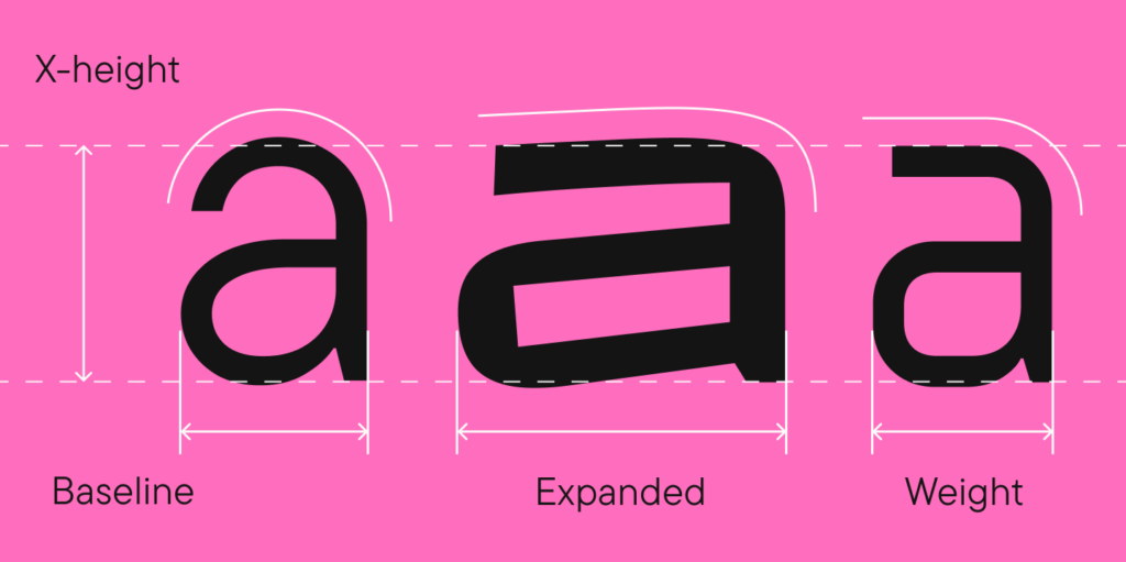
Typography and Reader Emotion
Typography influences emotional experience significantly.
Readers often react emotionally to visual presentation before processing content logically.
Emotional Effects of Typography
Elegant Fonts
Create sophistication and luxury.
Bold Fonts
Communicate strength and confidence.
Rounded Fonts
Feel friendly and approachable.
Thin Fonts
Appear modern and minimalist.
Typography subtly shapes how readers interpret tone and meaning.
The Importance of Visual Hierarchy
Visual hierarchy helps readers navigate content easily.
It guides attention toward the most important information first.
Elements of Visual Hierarchy
Headlines
Large and bold for emphasis.
Subheadings
Organize sections clearly.
Body Text
Comfortable for long reading.
Bold and Italic
Highlight important points.
White Space
Prevents visual overload.
Clear hierarchy improves content flow and user experience.
Line Spacing and Reader Comfort
Line spacing strongly affects readability.
Crowded text feels overwhelming.
Ideal Line Spacing
Moderate spacing improves:
- Reading speed
- Eye movement
- Reader focus
- Visual comfort
Too much spacing can also reduce reading flow. Balanced spacing creates smoother reading experiences.
The Role of White Space
White space refers to the space around text and design elements.
Many people underestimate its importance.
Benefits of White Space
- Reduces visual stress
- Improves focus
- Enhances organization
- Increases elegance
- Supports readability
Cluttered layouts often discourage readers from continuing.
Professional designs use white space strategically.
Typography in Print vs Digital Reading
Typography must adapt to different reading environments.
Print Typography
Print readers usually prefer:
- Serif fonts
- Longer reading flow
- Stable layouts
Books often use typography optimized for extended reading comfort.
Digital Typography
Digital reading requires:
- Responsive layouts
- Mobile optimization
- Clear screen readability
- Fast scanning ability
Online readers typically scan content rather than reading every word carefully. Typography should support this behavior.
Mobile-Friendly Typography
Mobile reading now dominates digital content consumption.
Typography must work effectively on smaller screens.
Mobile Typography Tips
Use Larger Font Sizes
Small text frustrates mobile users.
Keep Paragraphs Short
Improves readability.
Increase Line Spacing
Prevents visual crowding.
Avoid Large Text Blocks
Enhances scanning.
Use Clear Headings
Improves navigation.
Mobile-friendly typography improves user engagement and SEO performance.
Typography and Accessibility
Accessible typography ensures content is readable for all users, including people with visual impairments or reading difficulties.
Accessibility Best Practices
Strong Contrast
Improves visibility.
Readable Fonts
Avoid overly decorative typography.
Proper Font Size
Supports easier reading.
Avoid Excessive Capitalization
Large blocks of uppercase text reduce readability.
Accessible typography creates more inclusive reading experiences.
Typography and SEO
Typography indirectly affects search engine optimization.
Search engines prioritize user experience.
SEO Benefits of Good Typography
Lower Bounce Rates
Readable content keeps visitors longer.
Increased Engagement
Users interact more with clear content.
Better Mobile Experience
Supports Google ranking factors.
Improved Scannability
Organized content improves usability.
While typography itself is not a direct ranking factor, it strongly influences behavioral signals that impact SEO.
Typography in Book Publishing
Typography plays a critical role in books.
Poor formatting can ruin reader immersion.
Book Typography Best Practices
Use Comfortable Font Sizes
Usually between 10–12 points for print books.
Maintain Consistent Styles
Consistency improves professionalism.
Avoid Overly Decorative Fonts
Prioritize readability.
Use Proper Margins
Supports comfortable reading.
Professional typography improves reader satisfaction and perceived quality.
Typography in Web Design
Website typography affects user behavior dramatically.
Effective Website Typography Tips
Use Responsive Fonts
Adapt to different screen sizes.
Prioritize Readability
Avoid thin or difficult fonts.
Create Clear Hierarchy
Guide readers naturally.
Use Contrast Effectively
Improve visibility.
Typography influences website trust, branding, and conversion rates.
Common Typography Mistakes
Even valuable content can fail due to poor typography choices.
Major Typography Errors
Tiny Font Sizes
Hard to read.
Excessive Decorative Fonts
Reduce professionalism.
Poor Contrast
Hurts visibility.
Long Dense Paragraphs
Overwhelm readers.
Inconsistent Formatting
Creates confusion.
Overusing Bold or Italic
Weakens emphasis.
Avoiding these mistakes improves the reader experience immediately.
Actionable Typography Tips for Better Reader Experience
Practical Improvements You Can Apply Today
Choose Readable Fonts
Prioritize clarity over creativity.
Increase White Space
Improve visual breathing room.
Use Clear Headings
Organize content effectively.
Keep Paragraphs Short
Enhance readability.
Optimize for Mobile Devices
Support modern readers.
Maintain Consistent Styling

Strengthens professionalism.
Test Readability
Review content on multiple devices.
Small typography improvements can dramatically improve user engagement.
Why Professional Typography Builds Trust
Readers subconsciously associate typography quality with content quality.
Professional typography signals:
- Credibility
- Expertise
- Attention to detail
- Reliability
Poor typography may create doubt about the professionalism of the writer or brand.
Visual presentation strongly affects audience perception.
Future Trends in Typography
Typography continues evolving with digital technology.
Emerging Typography Trends
Variable Fonts
Flexible responsive typography.
Minimalist Design
Cleaner reading experiences.
Dark Mode Optimization
Improved screen comfort.
Accessibility-Focused Typography
Inclusive design practices.
AI-Assisted Typography
Automated readability improvements.
Modern typography increasingly focuses on user experience and adaptability. Typography affects reader experience far more than most people realize. It shapes readability, emotional response, visual appeal, comprehension, accessibility, engagement, and trust. Whether in books, websites, blogs, or digital publishing, typography directly influences how audiences interact with content.
Great typography allows readers to focus on ideas without distraction. Poor typography creates frustration and weakens communication. In today’s fast-moving digital world, strong typography is no longer optional. It is a critical part of professional content creation, SEO optimization, branding, and reader satisfaction. Whether you are an author, blogger, designer, marketer, or publisher, improving typography can dramatically enhance the impact of your content.
FAQs.
1. What is typography?
Typography is the art and technique of arranging text, including font style, size, spacing, alignment, and layout to improve readability and visual appeal.
2. Why is typography important for reader experience?
Typography improves readability, guides attention, creates emotional connection, and makes content more visually appealing and easier to understand.
3. How does typography affect readability?
Good typography uses clear fonts, proper spacing, and balanced layouts to reduce eye strain and help readers absorb information comfortably.
4. Which fonts are best for readability?
Simple and professional fonts like Garamond, Times New Roman, Arial, Helvetica, and Verdana are widely considered highly readable.
5. What is the difference between serif and sans-serif fonts?
Serif fonts have small decorative lines and are commonly used in print, while sans-serif fonts have a cleaner appearance and are popular for digital screens.
6. How does typography influence emotions?
Different font styles create different emotional impressions. For example, bold fonts may feel powerful, while elegant fonts may appear sophisticated and luxurious.
7. Why is white space important in typography?
White space improves readability, reduces visual clutter, increases focus, and creates a cleaner and more professional layout.
8. How does typography affect SEO?
Good typography improves user experience, reduces bounce rates, increases engagement time, and supports mobile readability, which can positively impact SEO performance.
9. What are common typography mistakes?
Common mistakes include using tiny fonts, poor spacing, low contrast, inconsistent formatting, overly decorative fonts, and large blocks of text.
10. Why is mobile-friendly typography important?
Mobile-friendly typography ensures text remains clear, readable, and visually organized on smaller screens, improving user experience and engagement.
fatimaali3rocket@gmail.comhttps://healthandtechnologies.comhttps://healthandtechnologies.com