
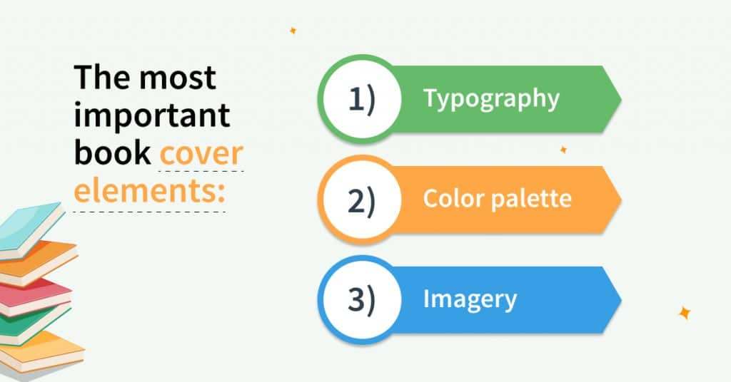
Elements of a Perfect Book Cover
A book cover is far more than a decorative image placed on the front of a book. It is one of the most powerful marketing tools an author can use. In today’s highly competitive publishing industry, readers often decide within seconds whether a book looks interesting enough to explore further. No matter how brilliant your writing may be, a weak cover can reduce your chances of attracting readers. On the other hand, a professionally designed and visually compelling cover can dramatically improve visibility, clicks, engagement, and sales.
The perfect book cover combines creativity, strategy, psychology, branding, and market understanding. It instantly communicates genre, mood, professionalism, and value while creating an emotional connection with readers.
Why Book Cover Design Matters
Readers judge books visually before they read descriptions, reviews, or sample pages.
A strong cover helps:
- Capture attention instantly
- Build trust and credibility
- Communicate genre clearly
- Create emotional appeal
- Increase online clicks
- Improve sales potential
- Strengthen author branding
Your cover acts as the face of your book.
In digital marketplaces where thousands of books compete for attention, a strong visual presentation becomes critical.
The First Impression Effect
Human brains process visuals extremely quickly. Research consistently shows that people form impressions within seconds.
Why First Impressions Matter
When readers see a book cover, they immediately evaluate:
- Professional quality
- Genre expectations
- Emotional tone
- Writing credibility
- Reader appeal
A polished design creates curiosity and confidence. A poorly designed cover may create doubts before readers even open the book.
Eye-Catching Typography
Typography is one of the most important elements of a successful book cover. The title must be clear, readable, and emotionally aligned with the content.
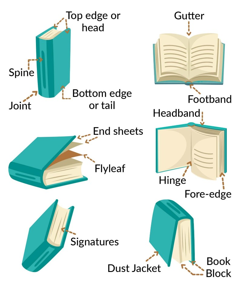
Characteristics of Strong Typography
Readability
Readers should easily recognize the title, even in thumbnail size.
Genre Compatibility
Fonts should match the mood of the book.
Proper Hierarchy
The title should stand out first, followed by subtitle and author name.
Simplicity
Overly decorative fonts can reduce clarity.
Typography Examples by Genre
Thriller
- Bold fonts
- Sharp edges
- Dramatic appearance
Romance
- Elegant typography
- Soft curves
- Stylish lettering
Fantasy
- Decorative fonts
- Mystical atmosphere
- Cinematic style
Business Books
- Clean and modern fonts
- Minimalist presentation
- Professional appearance
Typography strongly influences reader expectations.
Powerful Imager
Images create immediate emotional response.
A strong visual can communicate an entire mood or story instantly.
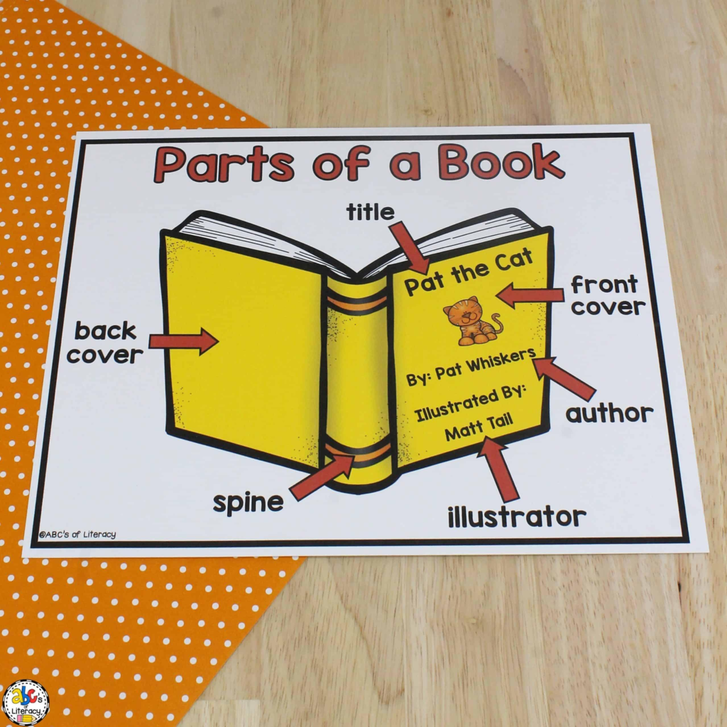
Effective Image Characteristics
High Quality
Blurry or pixelated images reduce professionalism.
Relevance
Images should connect with the book’s theme.
Emotional Appeal
Readers should feel something emotionally.
Simplicity
One strong focal point is often more powerful than multiple distractions.
Originality
Unique visuals help books stand out.
Strong imagery increases memorability and reader curiosity.
Color Psychology in Book Covers
Colors influence emotion and reader behavior.
Professional designers carefully select color schemes based on genre and audience psychology.
Common Color Meanings
Red
- Passion
- Danger
- Energy
- Excitement
Blue
- Trust
- Calmness
- Intelligence
Black
- Mystery
- Power
- Sophistication
White
- Simplicity
- Peace
- Clarity
Green
- Growth
- Nature
- Health
Yellow
- Creativity
- Optimism
- Warmth
Color choices shape the emotional atmosphere of the cover.
Strong Layout and Composition
A perfect book cover requires balanced visual structure.
Good composition guides the reader’s eye naturally.

Key Layout Principles
Visual Hierarchy
Important elements should stand out clearly.
Balance
Design elements should feel visually organized.
Spacing
Crowded layouts reduce readability.
Alignment
Clean alignment improves professionalism.
Focal Point
Readers should immediately know where to look first.
Professional composition improves clarity and engagement.
Genre Recognition Is Essential
Readers expect visual consistency within genres.
Successful book covers instantly communicate the type of story or content readers can expect.
Genre Cover Expectations
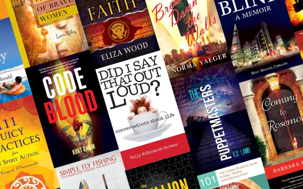
Romance Covers
- Warm colors
- Emotional imagery
- Elegant design
Horror Covers
- Dark tones
- Intense visuals
- Suspenseful atmosphere
Self-Help Covers
- Inspirational visuals
- Positive messaging
- Clean typography
Science Fiction Covers
- Futuristic elements
- Dramatic lighting
- Imaginative visuals
Ignoring genre expectations can confuse readers and reduce sales.
Simplicity Creates Stronger Impact
Many beginner authors overcrowd their covers with too many elements.
Professional book covers are often clean and focused.
Why Minimalism Works
Simple covers:
- Improve readability
- Stand out more effectively
- Look modern and professional
- Create stronger emotional focus
- Perform better online
Minimalist design helps readers process information quickly.
The Importance of Thumbnail Visibility
Most books today are discovered online.
Readers often see covers first as tiny thumbnails on mobile devices or websites.
Thumbnail Optimization Tips
Use Large, Clear Titles
Small text becomes unreadable online.
Avoid Excessive Details
Complex designs disappear at smaller sizes.
Focus on Contrast
Strong contrast improves visibility.
Test Mobile Appearance
Your cover should remain attractive on phones and tablets.
Online discoverability depends heavily on thumbnail effectiveness.
Emotional Connection Drives Reader Interest
The best book covers create emotional reactions instantly.
Readers are drawn toward covers that make them feel curious, excited, inspired, or emotionally invested.
Emotional Triggers in Cover Design

Mystery
Encourages curiosity.
Excitement
Creates energy and momentum.
Comfort
Makes readers feel emotionally safe.
Fear or Suspense
Builds tension and intrigue.
Inspiration
Motivates readers emotionally.
Emotionally engaging covers improve memorability and click rates.
Branding and Series Consistency
For authors writing multiple books, branding matters significantly.
Consistent visual identity helps readers recognize your work quickly.
Benefits of Consistent Branding
- Builds reader loyalty
- Improves recognition
- Creates professional image
- Strengthens marketing campaigns
- Supports long-term career growth
Many successful authors maintain similar typography, colors, or layouts across their books.
Professional Design vs DIY Covers
Some authors choose to design their own covers.
While this may reduce costs initially, professional design often produces stronger results.
Benefits of Professional Designers
Professional designers understand:
- Reader psychology
- Market trends
- Genre expectations
- Typography principles
- Color strategy
- Online marketplace behavior
A professionally designed cover can significantly improve perceived value.
Common Book Cover Mistakes
Avoiding mistakes is just as important as applying good design principles.
Major Cover Design Mistakes
Cluttered Layouts
Too many elements overwhelm readers.
Weak Typography
Unreadable fonts reduce professionalism.
Low-Quality Images
Poor visuals damage credibility.
Poor Color Choices
Weak contrast reduces visibility.
Ignoring Genre Standards
Confusing covers hurt marketing.
Overused Stock Images
Generic visuals reduce uniqueness.
Recognizing these mistakes can improve overall coverage effectiveness.
Actionable Steps to Create the Perfect Book Cover
Step 1: Research Your Genre
Study bestselling covers in your category.
Step 2: Define Your Audience
Understand what appeals to your readers.
Step 3: Focus on One Strong Idea
Avoid visual overload.
Step 4: Choose Readable Typography
Clarity matters more than decoration.
Step 5: Select Strategic Colors
Use colors that match emotional tone.
Step 6: Prioritize Simplicity
Minimalist layouts often perform better.
Step 7: Test Thumbnail Visibility
Ensure the design works online.
Step 8: Gather Feedback
Outside opinions can reveal weaknesses.
Professional covers are built through strategy, not random creativity.
SEO Benefits of Strong Book Covers
While search engines cannot fully interpret visuals the same way humans do, strong cover design still supports SEO indirectly.
How Covers Improve SEO Performance
Higher Click-Through Rates
Attractive covers encourage more clicks.
Better Social Sharing
Visual content spreads more easily online.
Improved User Engagement
Strong presentation increases browsing time.
Enhanced Author Branding
Professional visuals strengthen digital visibility.
SEO success and visual marketing work together.
Why Readers Trust Professional Covers
Readers often associate cover quality with writing quality.
A polished design signals professionalism, effort, and credibility.
Trust-Building Elements
- Clean typography
- Balanced layout
- High-quality imagery
- Consistent branding
- Genre accuracy
A professional presentation increases buyer confidence significantly. The elements of a perfect book cover go far beyond artistic beauty. A successful cover combines visual appeal, emotional psychology, readability, genre recognition, branding, and marketing strategy to attract readers effectively. In today’s crowded publishing landscape, your cover often determines whether readers stop scrolling and explore your book further. Professional authors understand that book cover design is not optional.
It is one of the most powerful investments you can make in your publishing success. Whether you write fiction, non-fiction, fantasy, romance, thrillers, self-help, or business books, focusing on strong cover design can dramatically improve visibility, reader engagement, and sales potential. Your cover is the gateway to your story. Make it impossible to ignore.
Frequently Asked Questions (FAQs)
1. What are the most important elements of a perfect book cover?
The most important elements include strong typography, high-quality imagery, balanced layout, genre-appropriate design, emotional appeal, and effective color choices.
2. Why is typography important in book cover design?
Typography affects readability, professionalism, mood, and first impressions. Clear and attractive fonts help readers instantly understand the book’s style and genre.
3. How do colors influence book cover success?
Colors create emotional reactions and influence reader perception. Different colors can communicate mystery, excitement, trust, romance, or inspiration.
4. Should a book cover match its genre?
Yes, genre-specific design helps readers recognize the type of book quickly and improves marketing effectiveness and audience targeting.
5. Why do simple book covers often perform better?
Simple covers are easier to read, more visually appealing, less distracting, and more effective in small thumbnail sizes on online platforms.
6. How important is thumbnail visibility for book covers?
Thumbnail visibility is extremely important because most readers discover books online through small images on websites, mobile apps, and digital marketplaces.
7. Can a professionally designed cover improve book sales?
Yes, professional cover design can increase reader trust, improve click-through rates, strengthen branding, and significantly boost sales potential.
8. What are common mistakes in book cover design?
Common mistakes include cluttered layouts, unreadable fonts, low-quality images, weak color contrast, and ignoring genre expectations.
9. Should self-published authors hire professional designers?
Hiring a professional designer is often beneficial because professionals understand market trends, reader psychology, visual hierarchy, and effective branding strategies.
10. How does a book cover support SEO and online visibility?
A strong book cover improves click rates, social sharing, reader engagement, and overall online performance, which can indirectly support SEO and discoverability.
fatimaali3rocket@gmail.comhttps://healthandtechnologies.comhttps://healthandtechnologies.com